Tracking LAN Uptime on My ASUS/Merlin Router – Lambda Plot
The introduction and architecture to the LAN uptime system that I have added to my ASUS/Merlin router has been described in a previous post. This post will focus on the Lambda function that plots the graph of the outages. The code for this lambda function can be found at the bottom of this post.
I’ve actually forced myself to finish up some other posts before getting to this one. This particular piece of functionality involved overcoming a few hurdles I did not anticipate. In other words, frustrating and ultimately fun.
To start with this lambda function is supposed to take data from a DynamoDB table and create a plot of when I have had issues with LAN uptime with the three channels; Wired, Wireless 2.4 Ghz, and Wireless 5 Ghz. My first attempts were to ignore the 3 channels by summing them together and then to plot each week of data as a separate line in a plot. It looked like this.
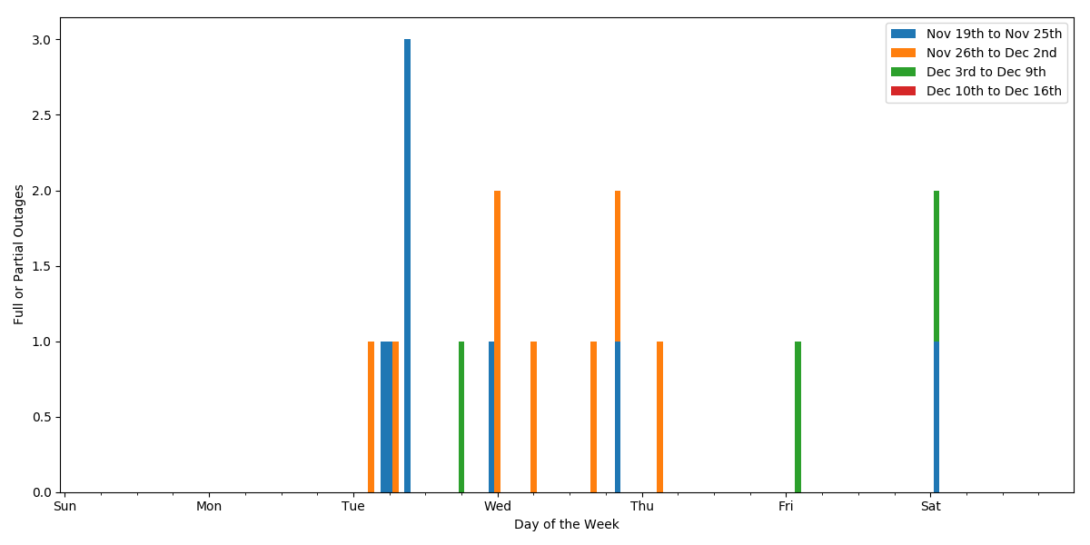
It it did reveal a nice pattern of Tuesday through Thursday problems. But this did not contain the detail on the channels so in the end I settled on this. Note, this is the live, daily updated, plot.
Nice thing about Pandas and Matplotlib libraries for python, is that most of the work is done for you. both graphs are roughly the same number of lines of plotting instructions. The big difference is that the first version required a different organization of the data in a dataframe. The second version is a much more straight-forward set of data in a dataframe.
While coding all of this I ran into a problem. The Python libraries for Pandas and Matplotlib are not available on Lambda. I certainly don’t want to code all of this by hand. Surely there is an easier way. Google! After doing some research I found that I needed to create my own deployment package and use the command line interface to upload the deployment package to Lambda. After getting into what this means I had a revelation of sorts. Lambda is a dumbed down version of Docker. I should have known this all along, but it really clicked a bunch of things together for me. So I had to build a deployment package.
Start with spinning up an EC2 instance with the following:
- Assign a role allowing Lambda command and S3 access.
- Install Python (make sure it comes with Pandas and Matplotlib)
- Install virtualenv
AWS provides a nice set of instructions for the set up. Zip up the project directory into a deployment package. and now I can add functions to that package and run a CLI command to deploy the package to lambda. I had a “oh no” moment when the deploy failed. I couldn’t find the error, but noticed that the deployment package was about 65 Meg. That is bigger than Lambda allows. Am I going to have to trim functions out of the deployment package. Not fun. Google! Ahhh, there is an undocumented larger limit to deployment packages if you first upload to S3 and then deploy to Lambda. Nice! It worked!
With that background, I can go into the python function in more detail. First is the initialization of some variables. The table keeps a moving 31 days of data. I didn’t feel the need to mess with the partial day at the beginning and end of the window so I decided to use 29 days in the middle. Yes, I could go 30 days, but I wanted to be sure about edge cases. Also, the dataframe is going to use an index that I call the DayHourId, but that value is going to be worthless in a plot, so I also initialize a variable called xlabel that will be populated as the days are processed and eventually assigned to the x-axis of the plot.
Then the dataframe is initialized. Each row of the dataframe will represent the status in a 5 minute window. The index will be the unchanged integer values and the four columns are:
- DayHourId – This started out as <day><hour> but since the hour range is from 0 to 23, values progress from 623 to 700 and that leaves a gap in the plot. So I converted the hours to hour * (100/24) which spreads the 24 hours out across 100 values evenly. This value is later used to sum outages by.
- Wired – The wired LAN channel outages. Use a value of 1 for outage during this 5 minute window or 0 for no outage. Initialized to a value of 1.
- 2.4Ghz – The wireless 2.4 Ghz channel outages. Use a value of 1 for outage during this 5 minute window or 0 for no outage. Initialized to a value of 1.
- 5Ghz – The wireless 5 Ghz channel outages. Use a value of 1 for outage during this 5 minute window or 0 for no outage. Initialized to a value of 1.
Now for each 29 days, the code is going to:
- Add to the xlabel the current day’s date in the format of ‘MMM DD’
- Read a days worth of status from the table. Not, to keep costs down, the table has only 1 RCU allocated, so reading by day should prevent spikes in RCU usage.
- Add the statuses to the dataframe. Calculate the index and assign the values to that index. This way a missing status leaves the dataframe values set to their default, which is 1 (Outage).
- Increment the timestamp to the next day.
Now the dataframe can be aggregated by DayHourId which will result in 29 * 24 = 696 rows which will be a good amount of detail in a plot that fits on the typical screen.
I added a step where the dataframe was exported as a CSV file to /tmp. I used that file with my own local copy of Jupyter notebooks to tweak the plot into a form I liked.
For the plot itself the first line of that section of the function creates the plot. The rest is used to create the axis labels and replace the X axis values with the xlabel array of values (MMM DD). The last line saves the plot into a PNG file in /tmp.
The final step is to move the CSV and PNG files to S3.
I had a lot of fun with this function. The code is below.
from boto3.dynamodb.conditions import Key, Attr
import pandas as pd
import numpy as np
import matplotlib
matplotlib.use('AGG')
import matplotlib.pyplot as plt
from matplotlib.ticker import MultipleLocator
import boto3
import json

print('Loading function')

def handler(event, context):
    print("Received event: " + dumps(event, indent=2))

    # initialize

    ddb = boto3.resource('dynamodb')

    tablename = 'lan'
    tstartdt = dt.today().date() - timedelta(days=29)
    tenddt = dt.today().date() - timedelta(days=1)
    tdt = tstartdt
    xlabel = ['']

    # initialize the raw dataframe

    rdf = pd.DataFrame(index=np.arange(0, 29 * 24 * 12), columns=['DayHourId', 'Wired', '2.4Ghz', '5Ghz'])
    rdf['DayHourId'] = rdf.apply(lambda x: ((int((x.name) / (24 * 12)) + 1) * 100) + (((int((x.name) / 12)) % 24) *(100.0/24.0)), axis = 1)
    rdf.fillna(1, inplace=True)

    # loop through the days

    for d in range(1,30):
        # add to xlabel

        xlabel = xlabel + [tdt.strftime('%b %d')]

        # read from dynamodb table

        dayid = tdt.strftime('%d%m%y')
        tbl = ddb.Table(tablename)
        resp = tbl.query (TableName=tablename, KeyConditionExpression=Key('DayId').eq(dayid))

        # add to dataframe

        for itm in resp['Items']:
            h = float(itm['CreateTS'][8:10])
            m = float(itm['CreateTS'][10:12])
            idx = ((int(d) - 1) * (24 * 12)) + int(h * 12) + int(m / 5)
            rdf.at[idx, 'Wired'] = 1 - int(itm['WiredAliveInd'])
            rdf.at[idx, '2.4Ghz'] = 1 - int(itm['Wireless24AliveInd'])
            rdf.at[idx, '5Ghz'] = 1 - int(itm['Wireless5AliveInd'])

        # increment the timestamp

        tdt = tdt + timedelta(days=1)

    # aggregate the week and add to the chart dataframe

    cdf = rdf.groupby('DayHourId').sum()

    # save the data

    cdf.to_csv('/tmp/lan-graph.csv')

    # build the plot

    [ax1, ax2, ax] = cdf.plot(kind='line', stacked=True, subplots=True, xlim=[100,3000], sharey=True, figsize=[11,6])
    ax.set_xlabel('Day of the Week')
    fig=ax1.figure
    fig.text(0.03, 0.5, 'Full or Partial Outages', ha='center', va='center', rotation=90)
    plt.xticks(rotation=-45)
    if (cdf['Wired'].min() + cdf['2.4Ghz'].min() + cdf['5Ghz'].min() + cdf['Wired'].max() + cdf['2.4Ghz'].max() + cdf['5Ghz'].max()) == 0.0:
        plt.ylim(-0.01, 1.01)
    majorLocator = MultipleLocator(100)
    minorLocator = MultipleLocator(100)
    ax.xaxis.set_major_locator(majorLocator)
    ax.xaxis.set_minor_locator(minorLocator)
    ax.set_xticklabels(xlabel)
    for tick in ax.xaxis.get_major_ticks():
        tick.label1.set_horizontalalignment('left')

    plt.tight_layout(rect=[0.03, 0, 1, 1])

    # save the plot

    plt.savefig('/tmp/lan-graph.png')

    # move file to s3

    s3 = boto3.client('s3')
    s3.upload_file ('/tmp/lan-graph.png', '<bucket>', 'mcdeath/export/lan-graph.png')
    s3.upload_file ('/tmp/lan-graph.csv', '<bucket>', 'mcdeath/export/lan-graph.csv')

    return